HEALING WITH A PURPOSE
Advanced Primary Care
This rebrand aligns the brand through a unified system. By refining the essentials, I created a clearer expression of who Advanced Primary Care is today and where it is headed, grounded in compassion, excellence, and purpose.
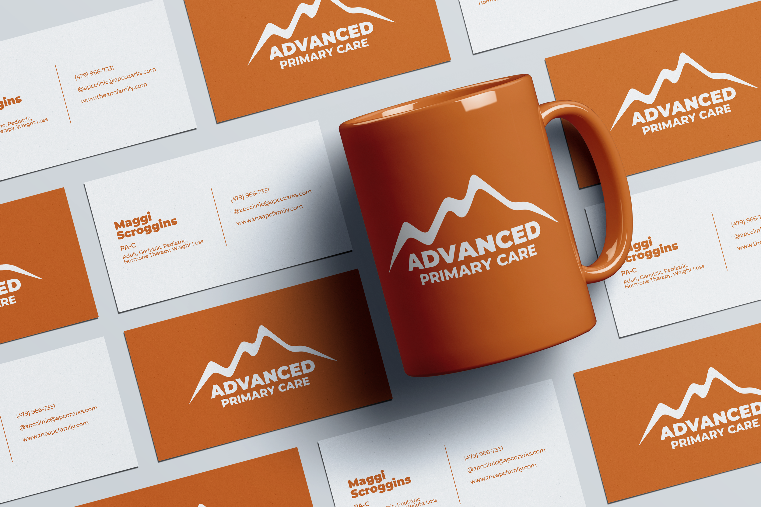
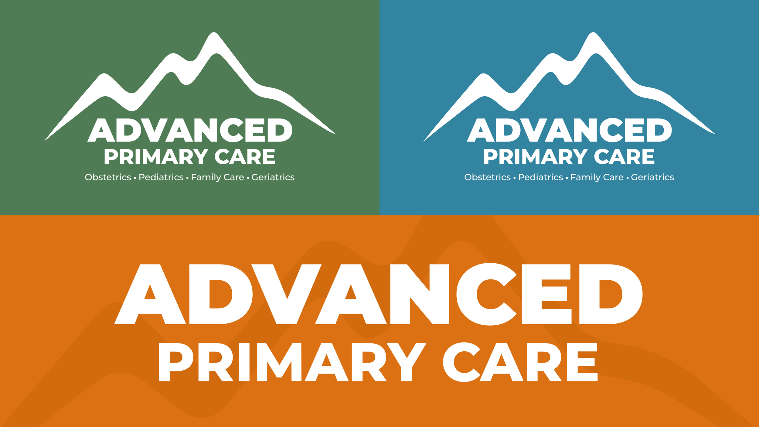
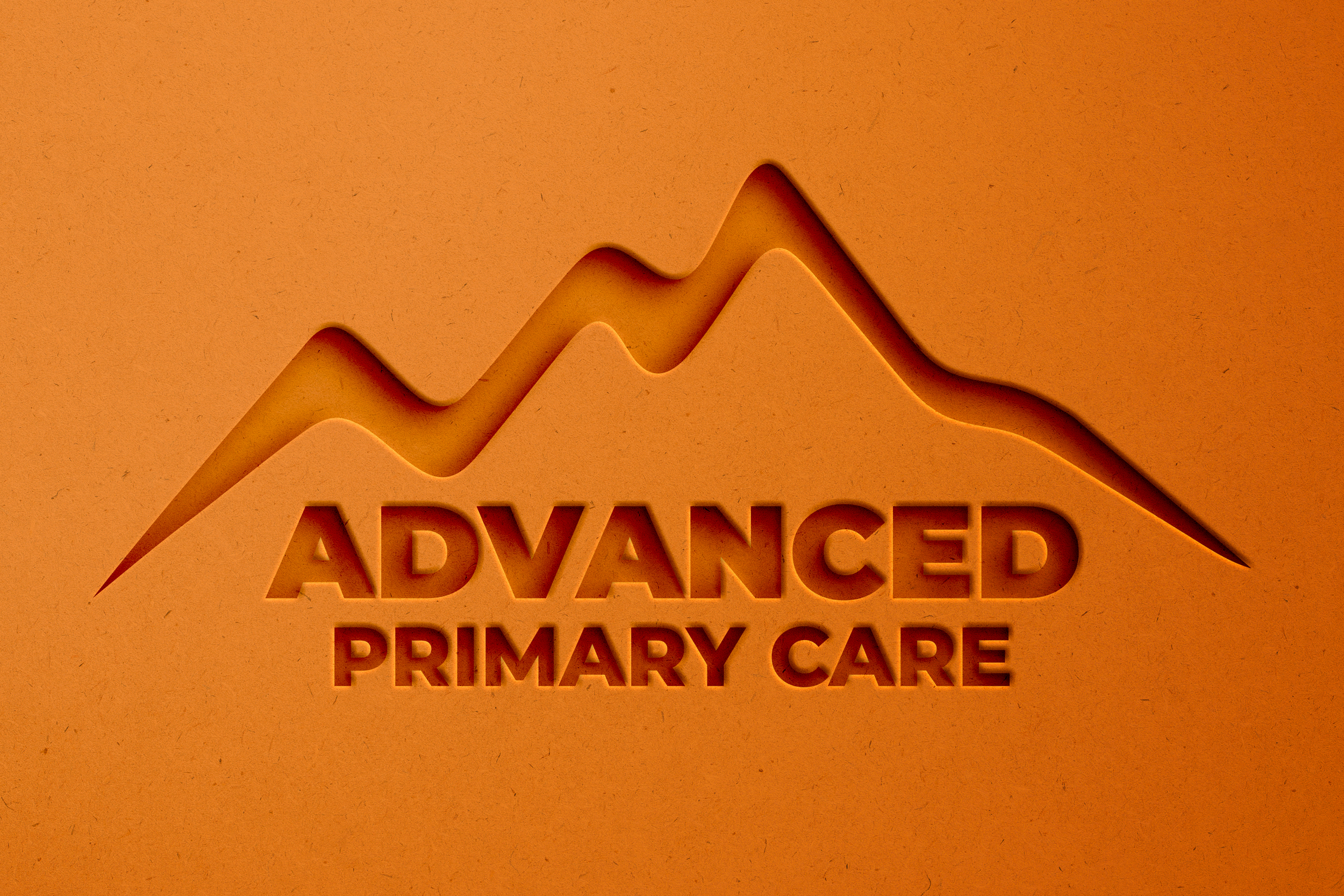
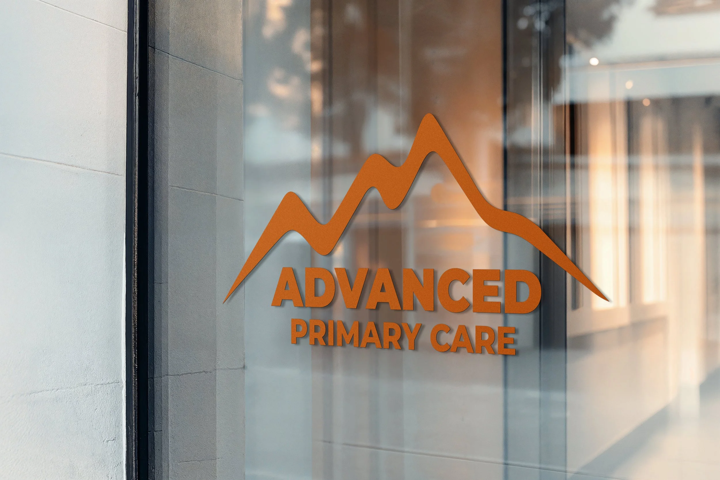
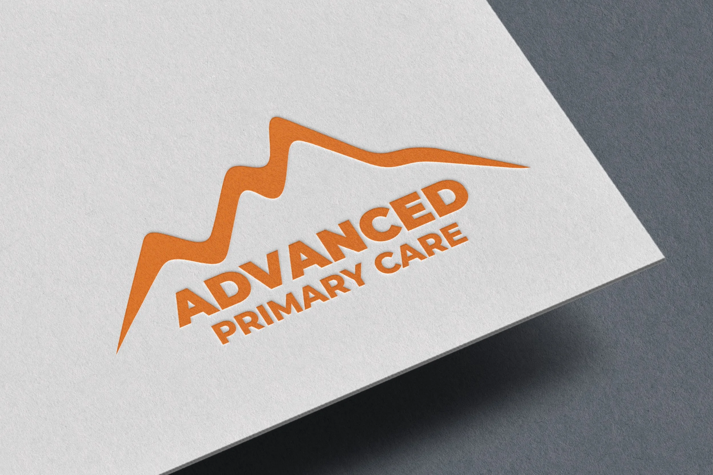
The Advanced Primary Care logo was refined to better reflect the heart of the brand. Strong, grounded typography conveys confidence and clinical excellence, while the rising mark symbolizes growth, stability, and guidance. Every element was simplified with intention, creating a mark that feels warm, trustworthy, and forward-looking. The result is a logo that stands with quiet confidence and clearly represents care built on purpose.
The brand is built on three primary colors inspired by the outdoors and the experience of health. Orange represents energy and human warmth, green reflects growth and renewal, and blue brings calm, trust, and clarity across the system.
Montserrat sans serif is a strong fit for the Advanced Primary Care refresh, balancing clarity, confidence, and approachability through clean, highly readable letterforms. Its broad range of weights allows the brand to stay consistent while flexing between warmth and authority across every touchpoint.